/ / R3 _ Sult$

Client Projects

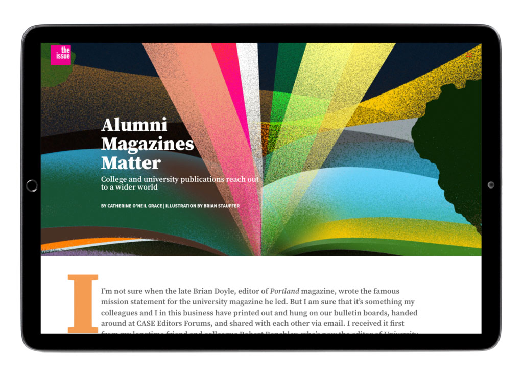
Feature spread designed for a digital publication, combining illustration, typography, and editorial hierarchy to introduce a long-form article about higher education magazines.

The Issue

The Issue is a publication to inform, inspire, and celebrate the work being created at and for member publications. In this digital publication the 2communiqué team collaborates with our content creation partners to develop articles, illustrations, photography, animation, and video to push the boundaries of what a publication can be and to take advantage of the digital medium. Each article is art directed to accurately merge the written and visual communication and to also develop a unique interactive experience.
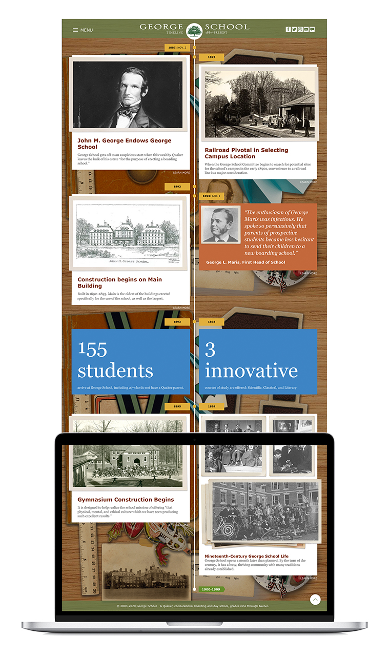
Responsive website experience combining content strategy, visual design, and interactive features to communicate institutional identity and support audience engagement across devices. Immersive digital timeline presenting institutional history through archival materials and storytelling.

George School website

George School, located in Newtown, Pennsylvania, is a boarding school rooted in the Quaker tradition. As their primary international marketing tool, the school’s website needed…

Black typographic Lark Street logo featuring stacked letterforms with decorative serif details and the word Street positioned below the mark.

Lark Street Identity

The culture of a place is, in essence, its brand. Neighborhoods within cities seek to communicate what makes them unique; it’s what the residents, business owners, and visitors feel…

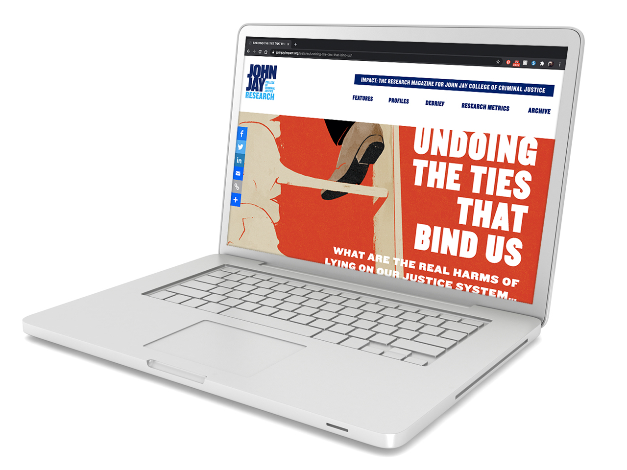
Laptop displaying an IMPACT magazine feature article titled “Undoing the Ties That Bind Us” on the John Jay College research publication website.

John Jay Impact

An annual report is powerful communication when it illuminates the impact of an organization, and John Jay College’s research magazine Impact is a good example. Once a traditional publication full of headshots, lists, and accolades, the college decided to…

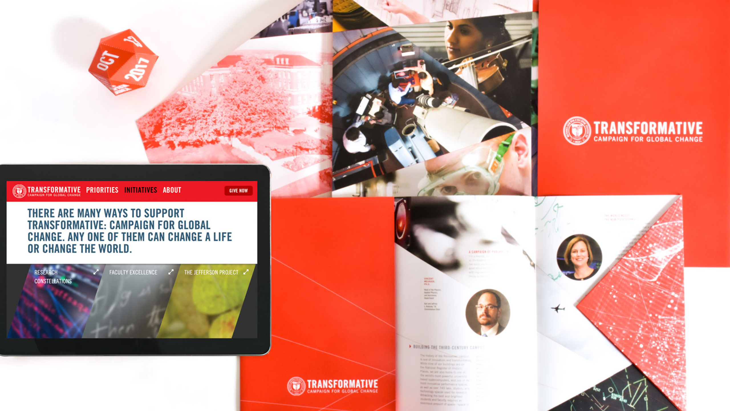
Campaign materials including website, brochures, print pieces, and branded collateral for a university fundraising campaign.

Rensselaer Capital Campaign

Launching a capital campaign is an important undertaking for an institution, and it is imperative that the campaign communications be strategic and impactful. During our intake meeting, we discovered that the advancement team relied heavily on printed one-sheet communications delivered to prospective donors. We moved this important content to the website to allow advancement officers to pivot seamlessly during a meeting and share targeted information in an interactive digital environment.

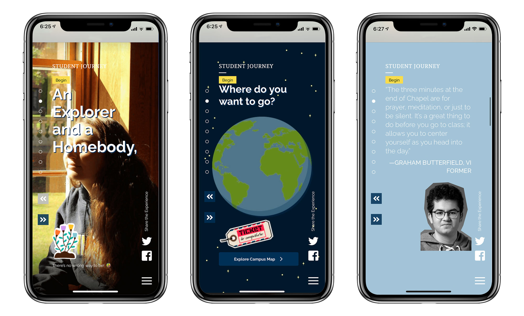
Three mobile screens from a St. Mark’s School student journey experience, showing interactive content including a student portrait, an illustrated globe, and a student testimonial with navigation controls and social media icons.

St. Mark’s Admission Campaign

What do a 14-year-old and 40-year-old have in common? Not much. Then why are enrollment communications created to speak to both segments simultaneously? Rethinking this traditional approach was the foundation for the microsite that we developed for St. Mark’s School. Our research showed that teenagers are drawn to visual sites with minimal copy and that they are primarily visiting these sites on their phones. So we designed a mobile version of the website to look and feel like a social media app and let the desktop version take advantage of the larger viewport with negative space, large images, and impactful typography.