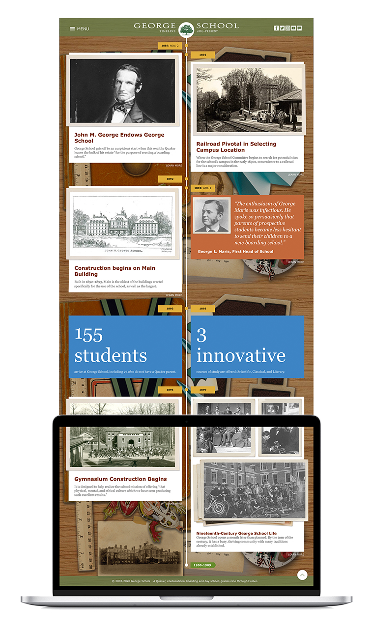
George School, located in Newtown, Pennsylvania, is a boarding school rooted in the Quaker tradition. As their primary international marketing tool, the school’s website needed…
User Personas Projects
George School, located in Newtown, Pennsylvania, is a boarding school rooted in the Quaker tradition. As their primary international marketing tool, the school’s website needed…
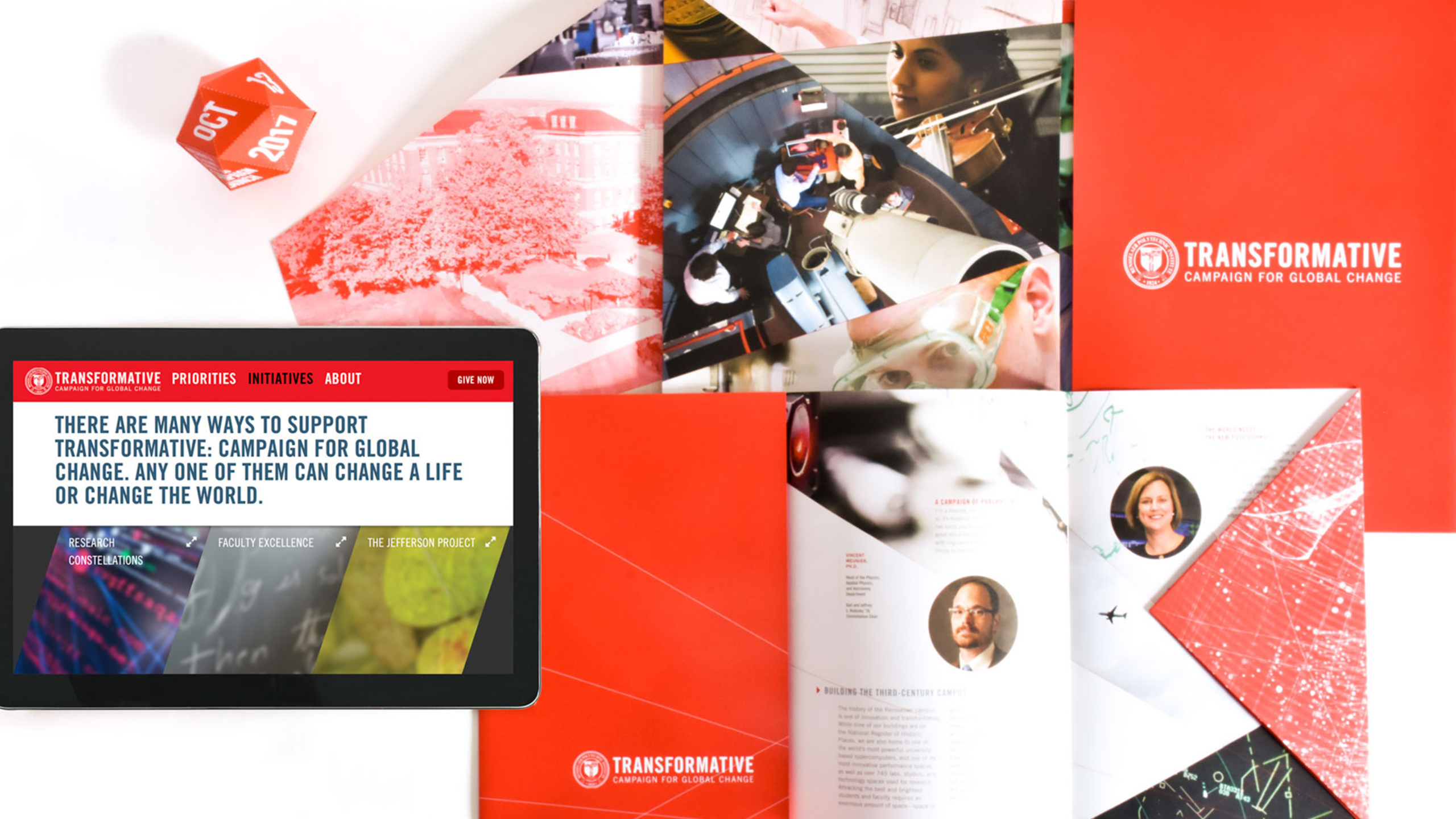
Launching a capital campaign is an important undertaking for an institution, and it is imperative that the campaign communications be strategic and impactful. During our intake meeting, we discovered that the advancement team relied heavily on printed one-sheet communications delivered to prospective donors. We moved this important content to the website to allow advancement officers to pivot seamlessly during a meeting and share targeted information in an interactive digital environment.
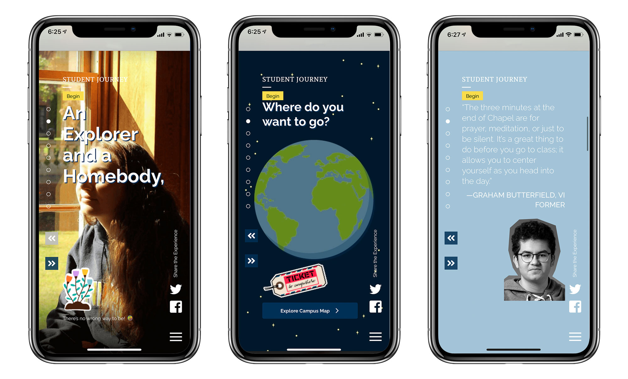
What do a 14-year-old and 40-year-old have in common? Not much. Then why are enrollment communications created to speak to both segments simultaneously? Rethinking this traditional approach was the foundation for the microsite that we developed for St. Mark’s School. Our research showed that teenagers are drawn to visual sites with minimal copy and that they are primarily visiting these sites on their phones. So we designed a mobile version of the website to look and feel like a social media app and let the desktop version take advantage of the larger viewport with negative space, large images, and impactful typography.
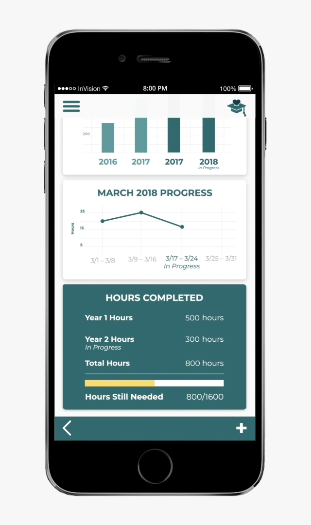
Fake it until you make it or prototype it until you develop it. Create a seamless user experience exemplified through a user flow in an interactive prototype for a digital product. Make it magical.