/ / R3 _ Sult$

Information Design Projects

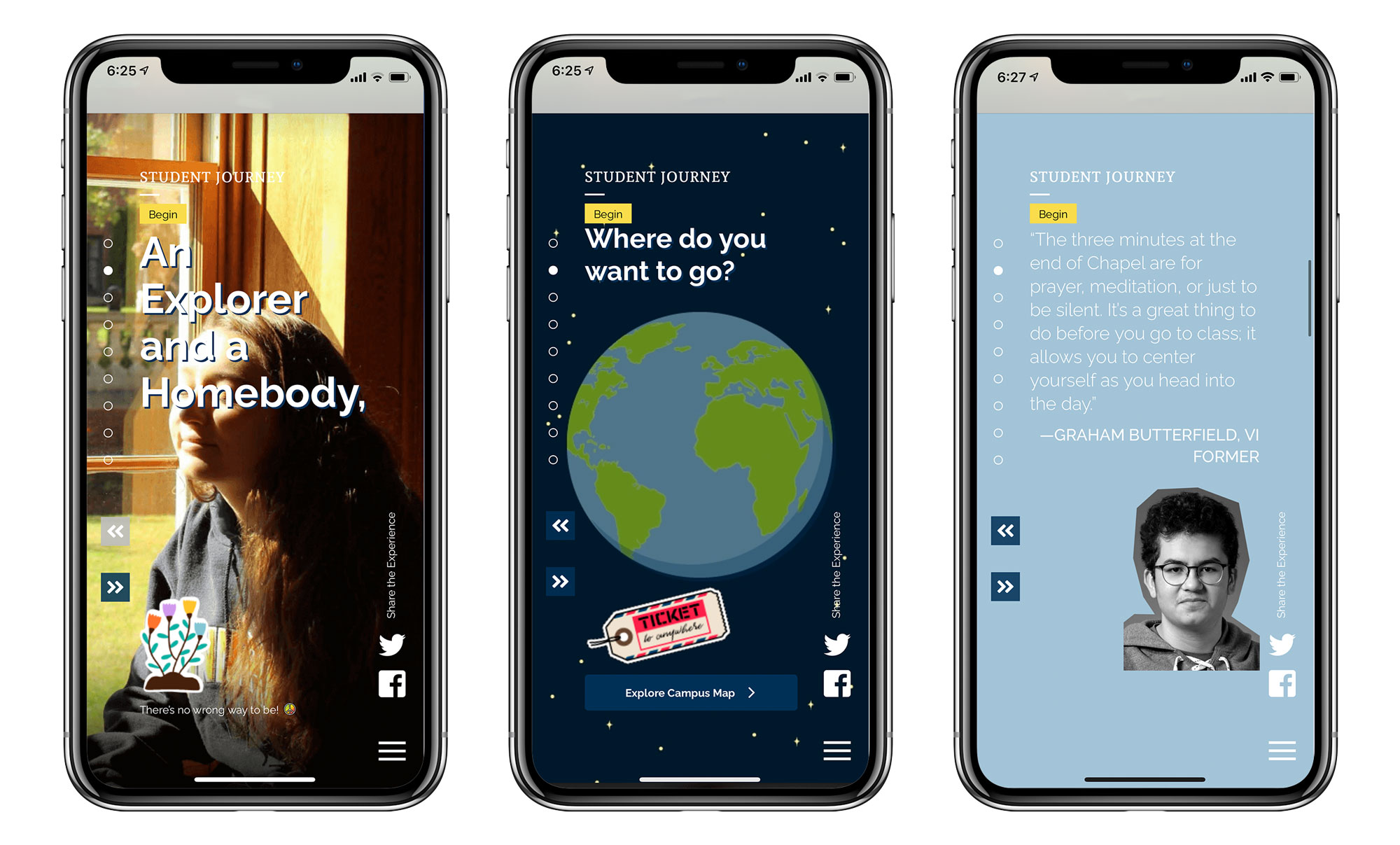
Three mobile screens from a St. Mark’s School student journey experience, showing interactive content including a student portrait, an illustrated globe, and a student testimonial with navigation controls and social media icons.

St. Mark’s Admission Campaign

What do a 14-year-old and 40-year-old have in common? Not much. Then why are enrollment communications created to speak to both segments simultaneously? Rethinking this traditional approach was the foundation for the microsite that we developed for St. Mark’s School. Our research showed that teenagers are drawn to visual sites with minimal copy and that they are primarily visiting these sites on their phones. So we designed a mobile version of the website to look and feel like a social media app and let the desktop version take advantage of the larger viewport with negative space, large images, and impactful typography.
Data visualization poster about Spotify listening habits featuring a large pie chart, genre labels, and layered typography in purple and yellow discussing music preferences and listening statistics.

Bio-Infographic

You are more than a number, but select something from your life to collect data about over the course of several weeks. Translate that data into an interactive infographic that reveals detailed layered information.

Mobile application splash screen for Mammoth Steakhouse featuring a bold black-and-turquoise logo with mountain imagery and an “Order Now” button centered on a white background.

Tablet Restaurant Menu

You’re hungry. Pull out your mobile device and order something. Translate the print version of your restaurant menu into a digital menu. Then prototype the experience of ordering yummy food and drink.

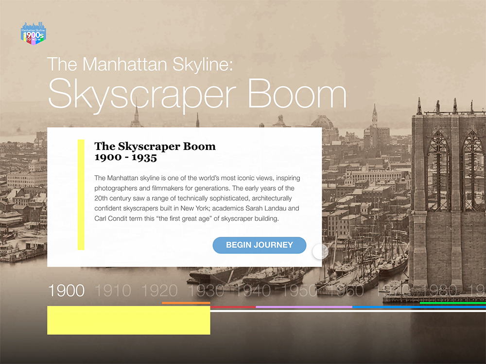
Interactive website screen titled “The Manhattan Skyline: Skyscraper Boom” featuring a historic photograph of New York City, explanatory text, a timeline, and a button labeled “Begin Journey.”

Interactive Timeline

Research a topic, develop three user flows, and design an interface of an interactive timeline that the user would interact with while achieving their goals. Let’s interact with our history.

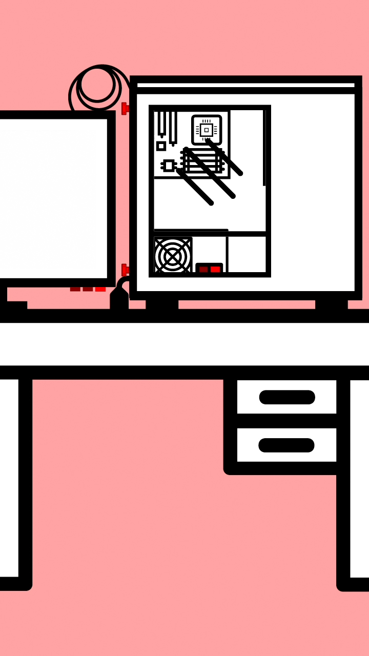
Minimal illustration of an open desktop computer tower shown in cross section, revealing internal components and tools against a pink background with black, white, and red geometric linework.

How-to Motion Graphic

Do or do not. There is no try, but how? Design a how-to motion graphics animation that explains how to or not to do something. Use motion design principles to communicate the key information and to create transitions.

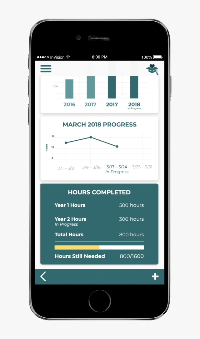
Mobile app dashboard displayed on a smartphone screen showing volunteer or service-hour progress with bar charts, line graphs, completed hours, and progress tracking information.

Mobile App

Fake it until you make it or prototype it until you develop it. Create a seamless user experience exemplified through a user flow in an interactive prototype for a digital product. Make it magical.