/ / R3 _ Sult$

After Effects Projects

Experimental typographic alphabet constructed from GPS running routes, transforming mapped paths into letterforms and numerals.

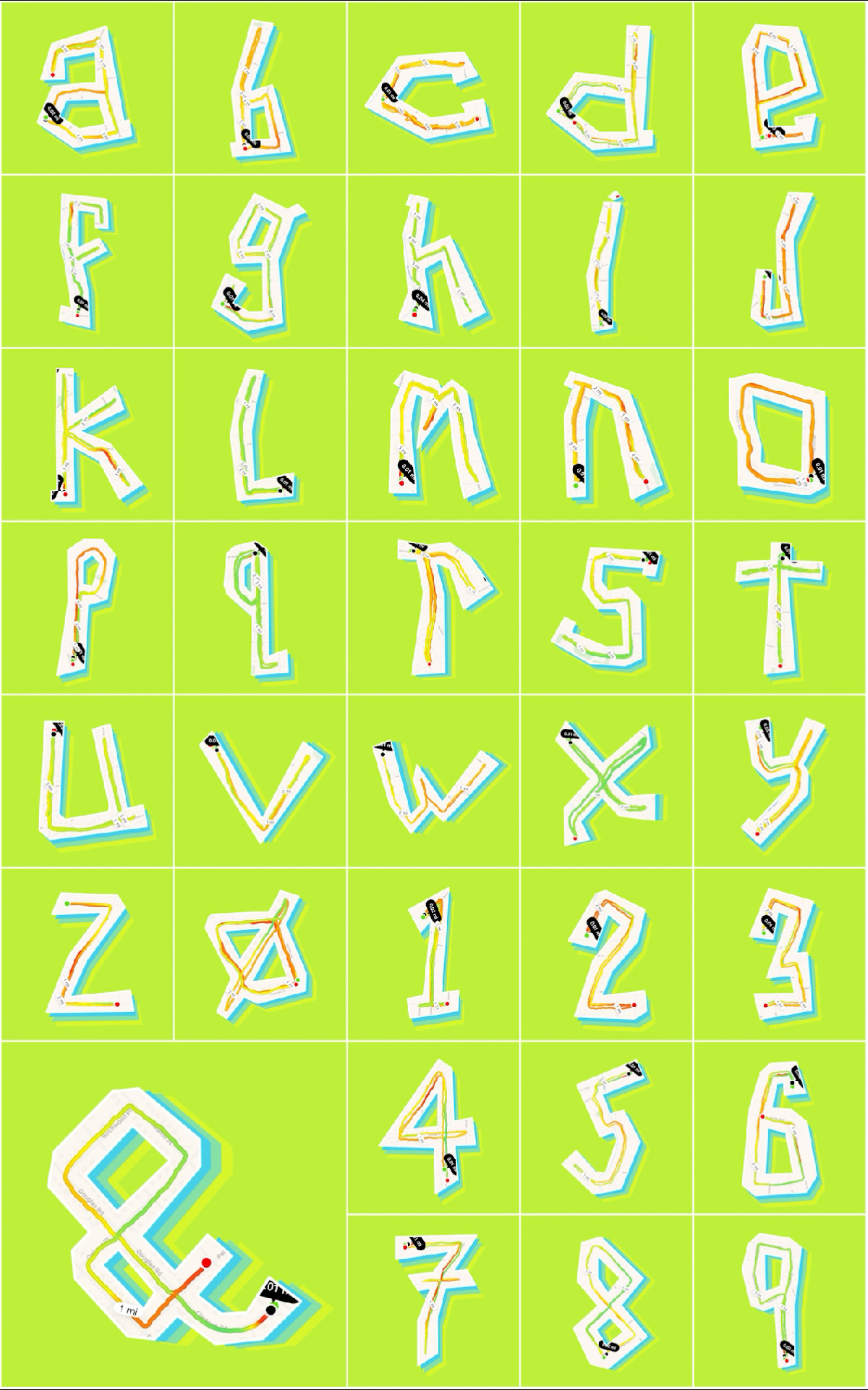
ABCRun

Running can sometimes be boring if it’s done as part of a training program. So, one year while training for a half-marathon I decided to create a typeface that uses my running routes to create the 26 characters of the alphabet plus 0 – 9 and an ampersand symbol. This required an experimental interpretation of the structure of letterforms as well as a detailed inspection of the map containing my neighborhood. The result is a typeface that moves or runs.

This typographic exploration transforms the word itself into an expressive visual composition. The enlarged letterforms extend beyond the boundaries of the page, emphasizing shape, rhythm, and gesture over immediate readability. Through cropping, overlap, and scale, the composition encourages viewers to engage with the formal qualities of the type while gradually discovering the underlying word. The restrained color palette and confident use of negative space reinforce the poster’s emphasis on abstraction and typographic form.

Solipsistic Word

Select a word that implies movement. Communicate the meaning the word using only the letters in the word and motion design principles. Explore motion, speed, duration, and ease.

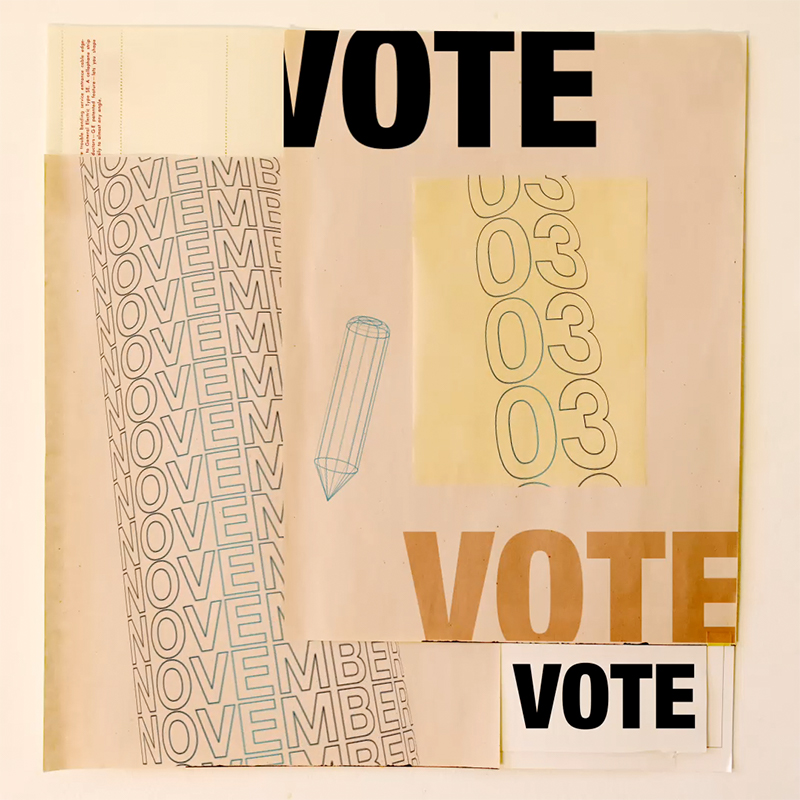
Collaged poster encouraging voting, composed of layered paper textures, repeated “November” typography, outlined numerals, and multiple bold “VOTE” headlines.

Vote

So many things were going on in the summer of 2020. This project was my way to process all that I was consuming and possibly inspire people to learn about some of the things that I was reading about. I researched quotes that touched on current events topics and used these to bring in a human element while exploring some design principles about time, motion, and space. Vote!

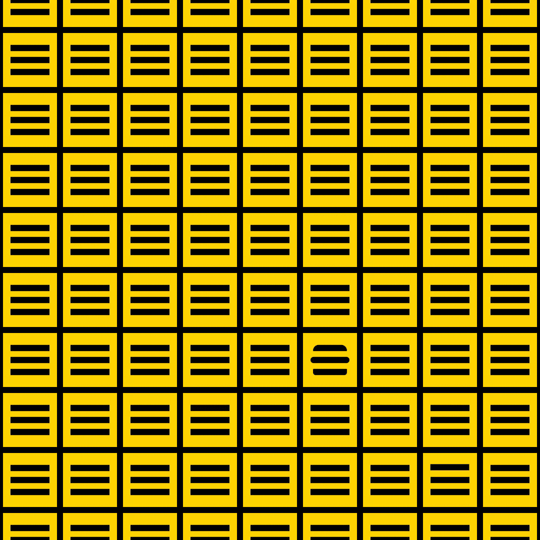
Animated square composition of a yellow modular grid composed of repeating black horizontal bars, with one rounded form interrupting the otherwise uniform pattern.

Can I Get Fries with That?

“Can I Get Fries with That?” explores both bold and subtle variations in the transition of two symbols commonly found in interactive screen-based experiences — the ubiquitous and equally infamous mobile menu symbol, also known as the hamburger menu (≡), and the close symbol (X). There are countless ways within the timeframe of one second in which the three little lines of the mobile menu symbol can transition into the two lines of close symbol to connect the user with the overall experience of a digital product. In the design of these microinteractions one second can be just enough time, but mostly it feels like an eternity.

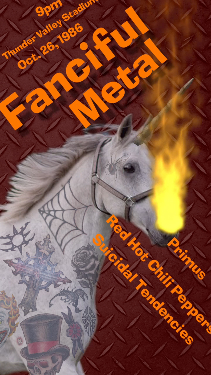
Concert poster for “Fanciful Metal” featuring a tattooed white horse with a unicorn horn breathing fire against a textured metal background, with orange typography listing the date, venue, and band names.

Motion Music Poster

If it’s too loud, you’re too old. That statement has no relevance in this project. Design an environmental motion poster without sound that communicates a genre of music while delivering information about a music event. 🤘

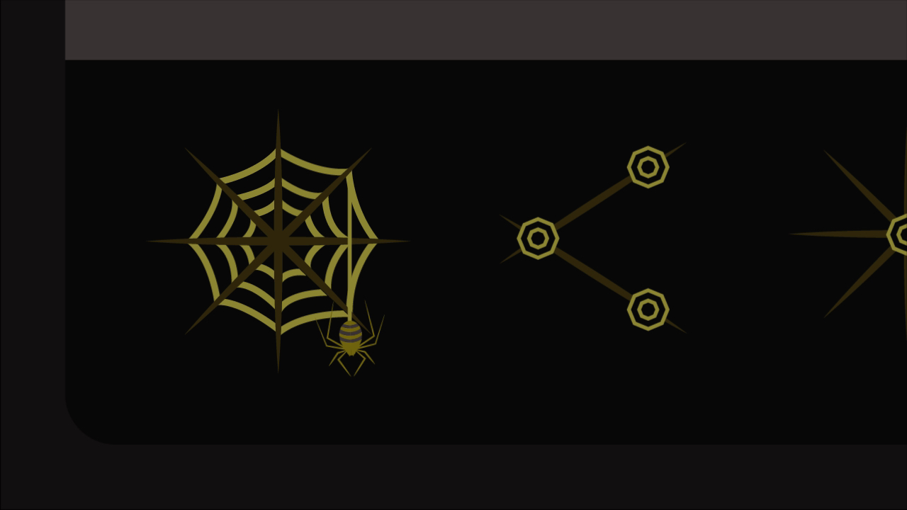
Minimal interface icon study featuring a stylized spider web, spider illustration, and geometric network symbols rendered in gold against a black background.

UI Microinteractions

To paraphrase Bob Ross, over here lives a happy little icon. Design the magic of motion to bring the user interface symbol to life. Click it and smile.

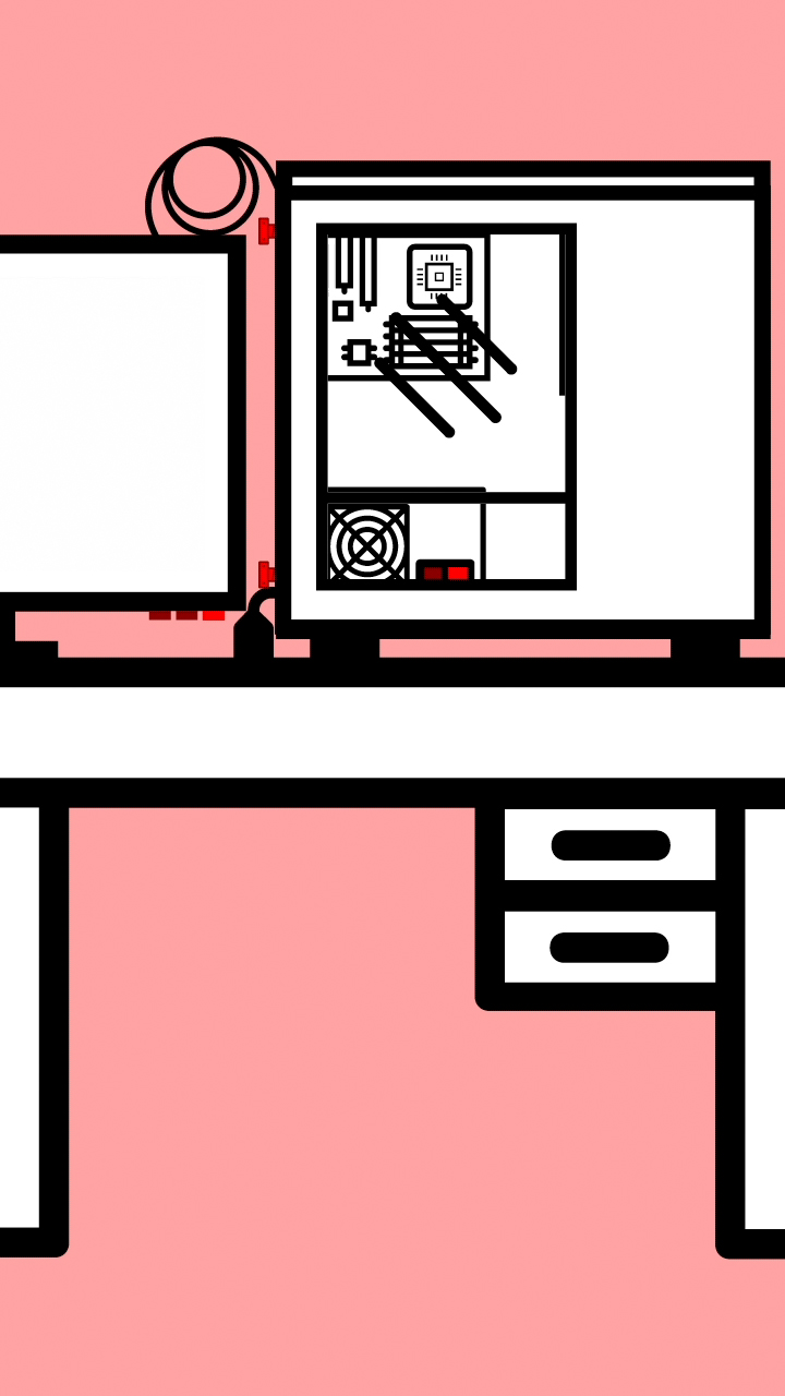
Minimal illustration of an open desktop computer tower shown in cross section, revealing internal components and tools against a pink background with black, white, and red geometric linework.

How-to Motion Graphic

Do or do not. There is no try, but how? Design a how-to motion graphics animation that explains how to or not to do something. Use motion design principles to communicate the key information and to create transitions.

Minimal title graphic displaying the word “Curio” in turquoise script centered on a light woodgrain background.

Mobile App Trailer

Can an audience fall in love with a digital product? Make an engaging promotional trailer that explains the core function of the app. Base the trailer on previously conducted audience research.

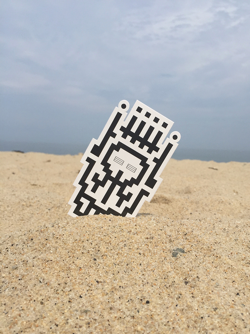
A die-cut sticker featuring a black-and-white pixel mask stands partially buried in beach sand against a cloudy sky. The outdoor setting contrasts the digital-inspired graphic with the natural texture of the sand and horizon.

Robot Monster Skull King Squad

One weekend a few years ago I played Legos with the kids, watched some football, and started reading some Transformers comic books. The result is a design system of skulls, monster heads, antennae, grills, and crowns that can be configured to create hundreds of totems. They are the Robot Monster Skull King Squad. The Squad is a project I use to explore various tools, materials, and processes. The project has included block prints, stickers, t-shirts, fuse beads, virtual reality, and augmented reality.