/ / R3 _ Sult$

Experimental Projects

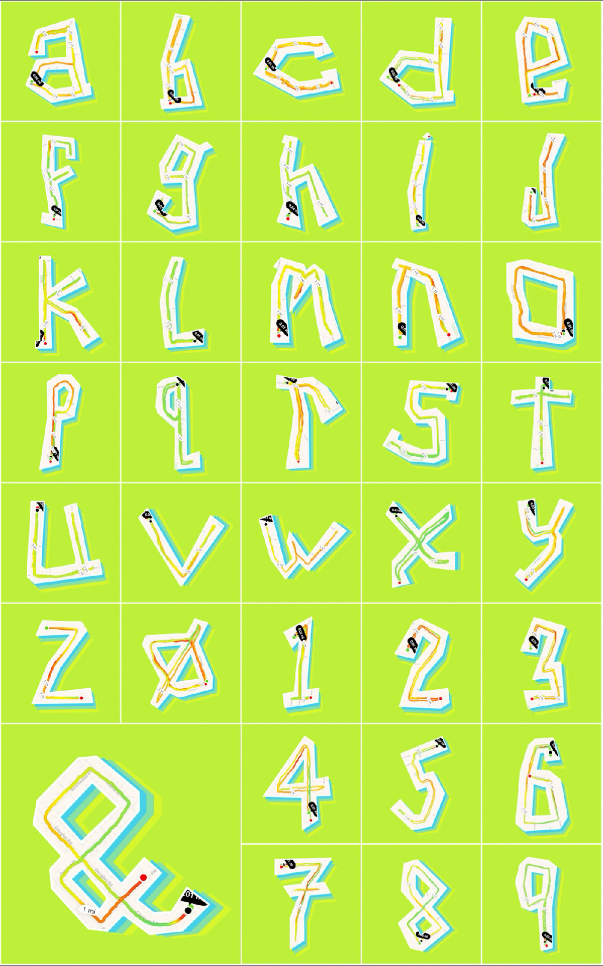
Experimental typographic alphabet constructed from GPS running routes, transforming mapped paths into letterforms and numerals.

ABCRun

Running can sometimes be boring if it’s done as part of a training program. So, one year while training for a half-marathon I decided to create a typeface that uses my running routes to create the 26 characters of the alphabet plus 0 – 9 and an ampersand symbol. This required an experimental interpretation of the structure of letterforms as well as a detailed inspection of the map containing my neighborhood. The result is a typeface that moves or runs.
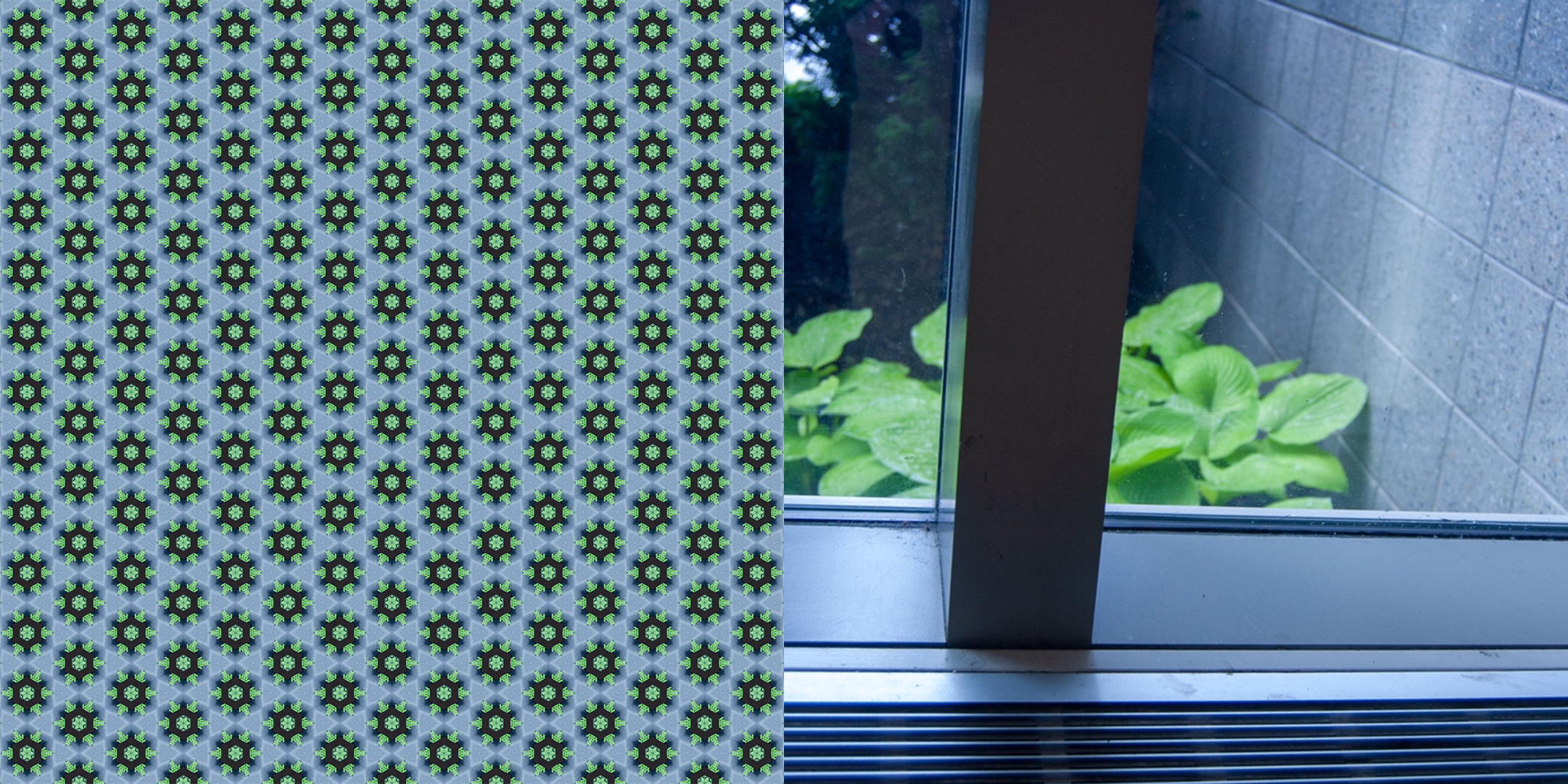
A green and gray hexagonal motif created from window views and surrounding foliage is presented beside a view through glass toward plants and exterior masonry. The repeated pattern translates organic and architectural elements into a modular visual system.

Quotidian Motifs

In the summer of 2019 I was invited to create a series of images in response to the prompt for an upcoming group show at the Albany International Airport Gallery. The prompt from the gallery director was to use the airport as inspiration for a project. In my case, I photographed objects and spaces that travelers and employees pass by everyday. These photographs were transformed into repeating patterns that highlighted these ordinary objects and spaces.

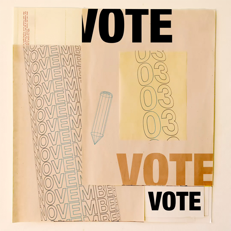
Collaged poster encouraging voting, composed of layered paper textures, repeated “November” typography, outlined numerals, and multiple bold “VOTE” headlines.

Vote

So many things were going on in the summer of 2020. This project was my way to process all that I was consuming and possibly inspire people to learn about some of the things that I was reading about. I researched quotes that touched on current events topics and used these to bring in a human element while exploring some design principles about time, motion, and space. Vote!

A professional headshot partially obscured by a multicolored spinning pinwheel loading icon positioned over the center of the face.

Resist Pai

Resisting Pai is easy when the chairman of the FCC wants to destroy an open internet in favor of corporations. This project is a direct response to chairman Pai’s repeal of the Net Neutrality rules put in place in 2015. Each image is a visualization of what can happen when corporations control the speed of the data that travels along the information superhighway.

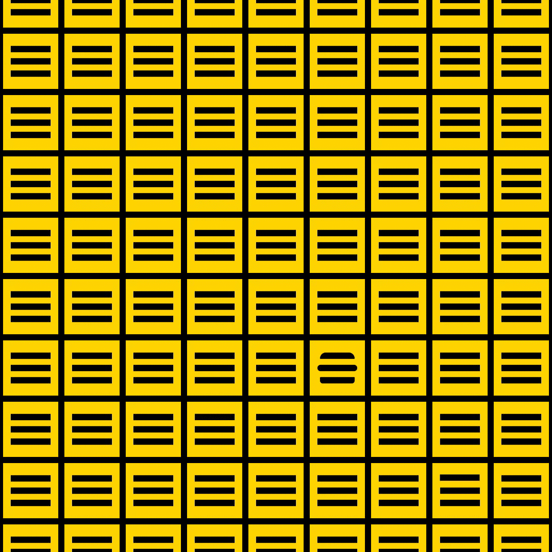
Animated square composition of a yellow modular grid composed of repeating black horizontal bars, with one rounded form interrupting the otherwise uniform pattern.

Can I Get Fries with That?

“Can I Get Fries with That?” explores both bold and subtle variations in the transition of two symbols commonly found in interactive screen-based experiences — the ubiquitous and equally infamous mobile menu symbol, also known as the hamburger menu (≡), and the close symbol (X). There are countless ways within the timeframe of one second in which the three little lines of the mobile menu symbol can transition into the two lines of close symbol to connect the user with the overall experience of a digital product. In the design of these microinteractions one second can be just enough time, but mostly it feels like an eternity.

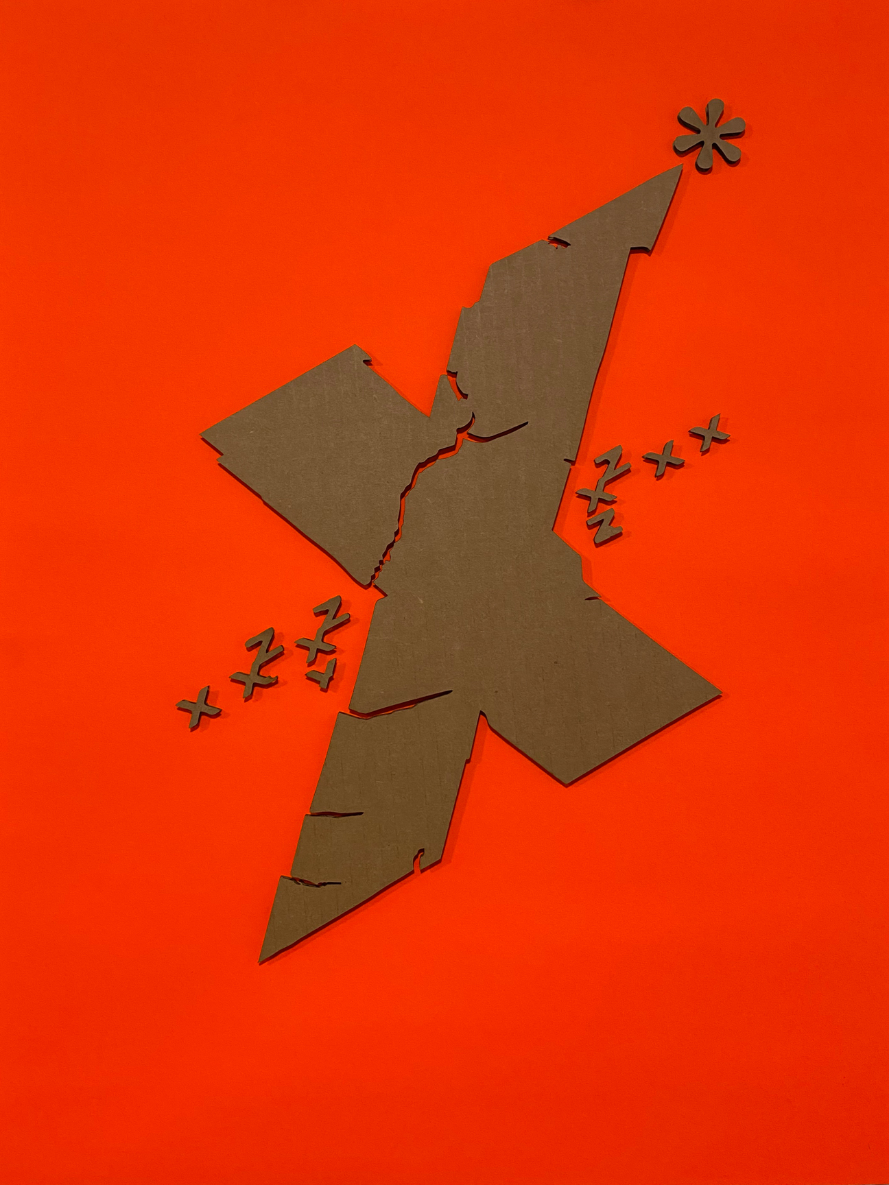
Abstract composition built around an angular X-shaped form, using fracture lines and repeated symbols to suggest tension and movement.

Type Transfer Lasercuts

The original type transfers were created as an experiment of randomness, play, and response. The laser cuts further explore those aspects of process in the digital environment. The digital tools provide opportunities to replicate exactly specific parts of the design to create compositions are both analog and digital. The use of the substrate was intentional to juxtapose the analog material of cardboard and the production tool of laser cutter.

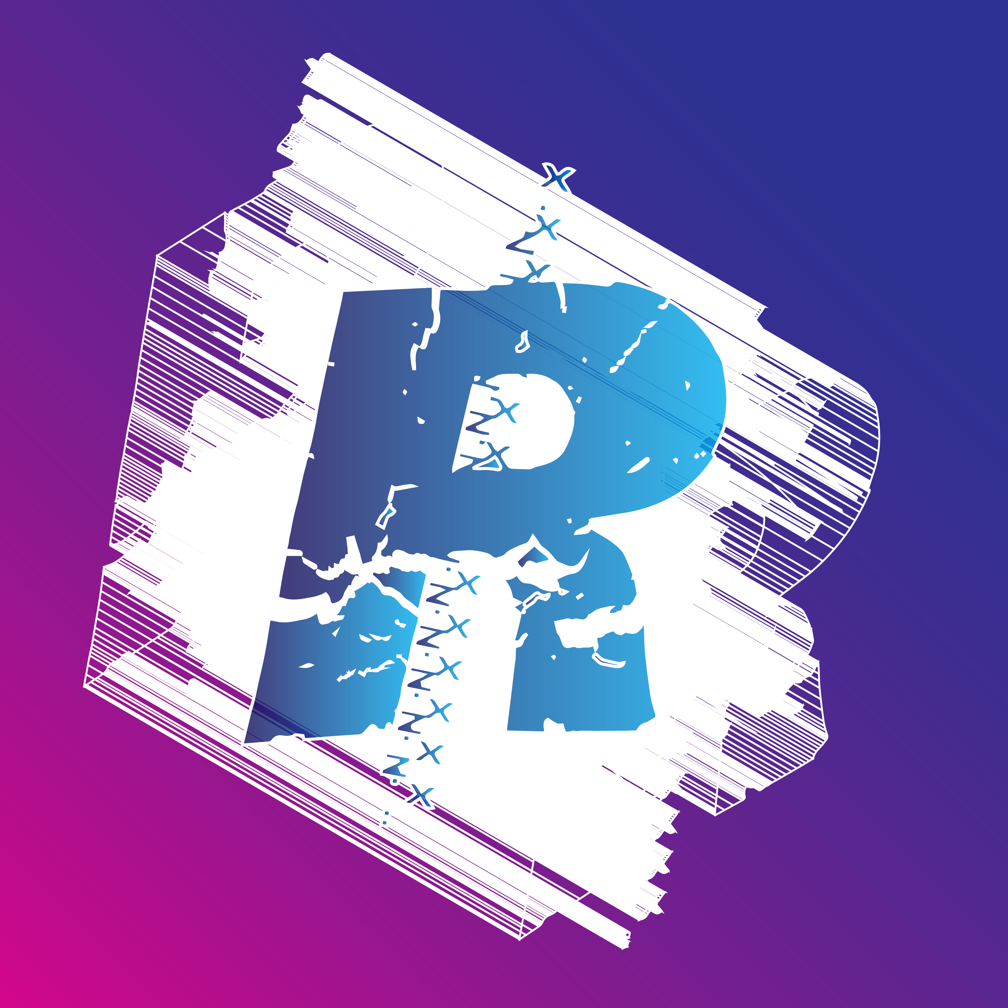
Experimental letter R composition with distressed white textures, blue gradients, and stitched graphic elements against a purple and magenta background.

Polatype Transfers

What do we gain and lose as a result of new technologies is always a question that follows innovation. Do we like the Polaroid film because of the materiality of it or because it reminds us of a part of our history or because it’s instant? The Polatype Transfers is an experiment of analog and digital technologies that explores the strengths of those technologies. The result is a series of images that are old and contemporary; photograph and print; handmade and digitally made; and something entirely new.

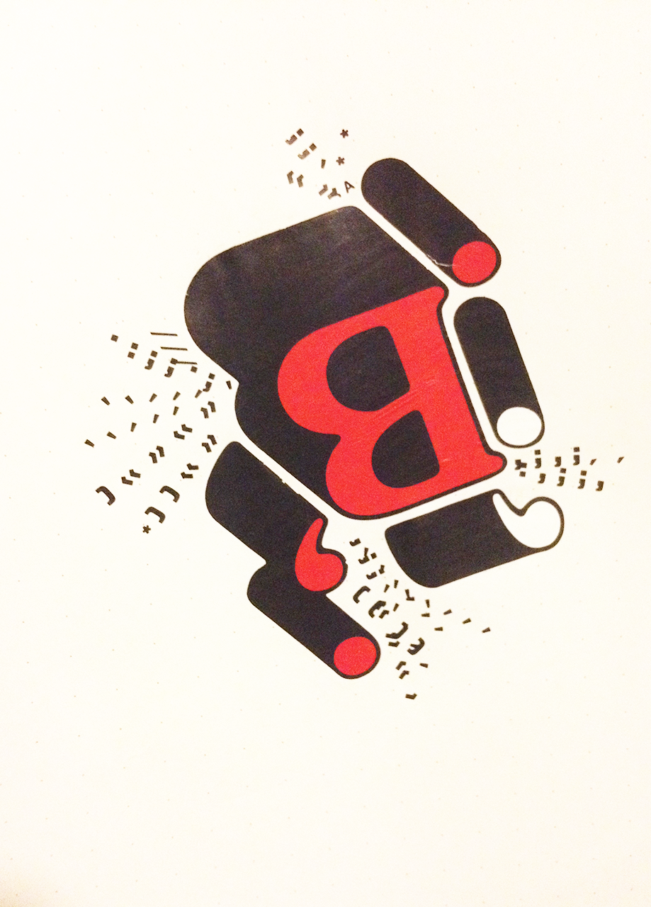
A large red capital B sits within a black abstract form at the center of the composition. Rounded black shapes containing red and white circular elements surround the letter while small fragmented symbols and punctuation scatter outward, suggesting movement, sound, and typographic disruption.

Type Transfers

These typographic experiments are the result of random exploration of an old design artifact, press type, that is deteriorating and hard to control. I let the press type process of burnishing and scraping tell me where to go and when to stop. This is a way to be creative in the moment and let go.

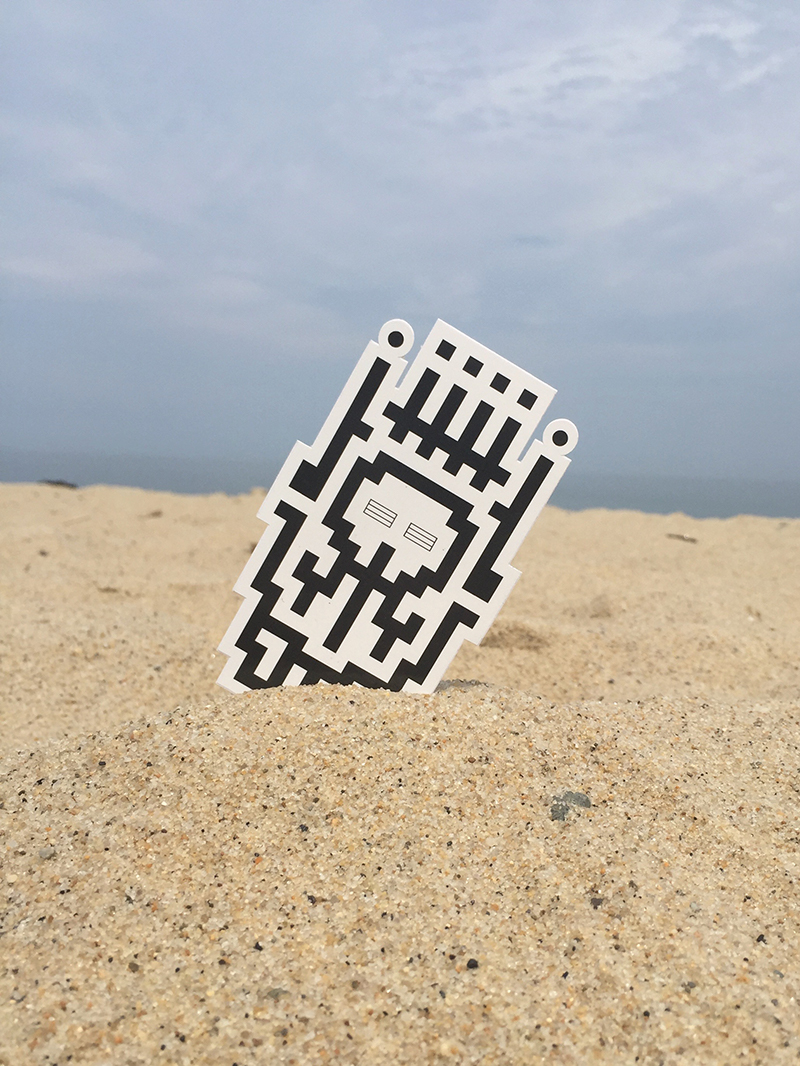
A die-cut sticker featuring a black-and-white pixel mask stands partially buried in beach sand against a cloudy sky. The outdoor setting contrasts the digital-inspired graphic with the natural texture of the sand and horizon.

Robot Monster Skull King Squad

One weekend a few years ago I played Legos with the kids, watched some football, and started reading some Transformers comic books. The result is a design system of skulls, monster heads, antennae, grills, and crowns that can be configured to create hundreds of totems. They are the Robot Monster Skull King Squad. The Squad is a project I use to explore various tools, materials, and processes. The project has included block prints, stickers, t-shirts, fuse beads, virtual reality, and augmented reality.

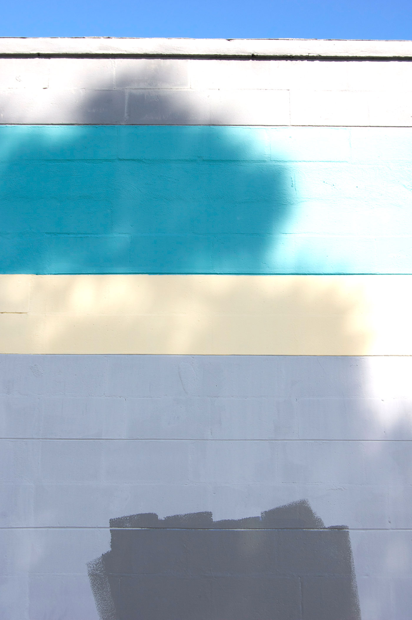
Horizontal bands of white, turquoise, cream, and gray stretch across a painted cinder block wall. Soft tree shadows drift across the surface, introducing movement and atmosphere while emphasizing the graphic qualities of color fields and architectural geometry.

Rothko Graffiti Screens

Unintentional art created when business owners and city workers try to paint over graffiti. The combination of painted fields of color, sky, and ground create images reminiscent of Mark Rothko’s signature style paintings.