/ / R3 _ Sult$

Expressive Type Projects

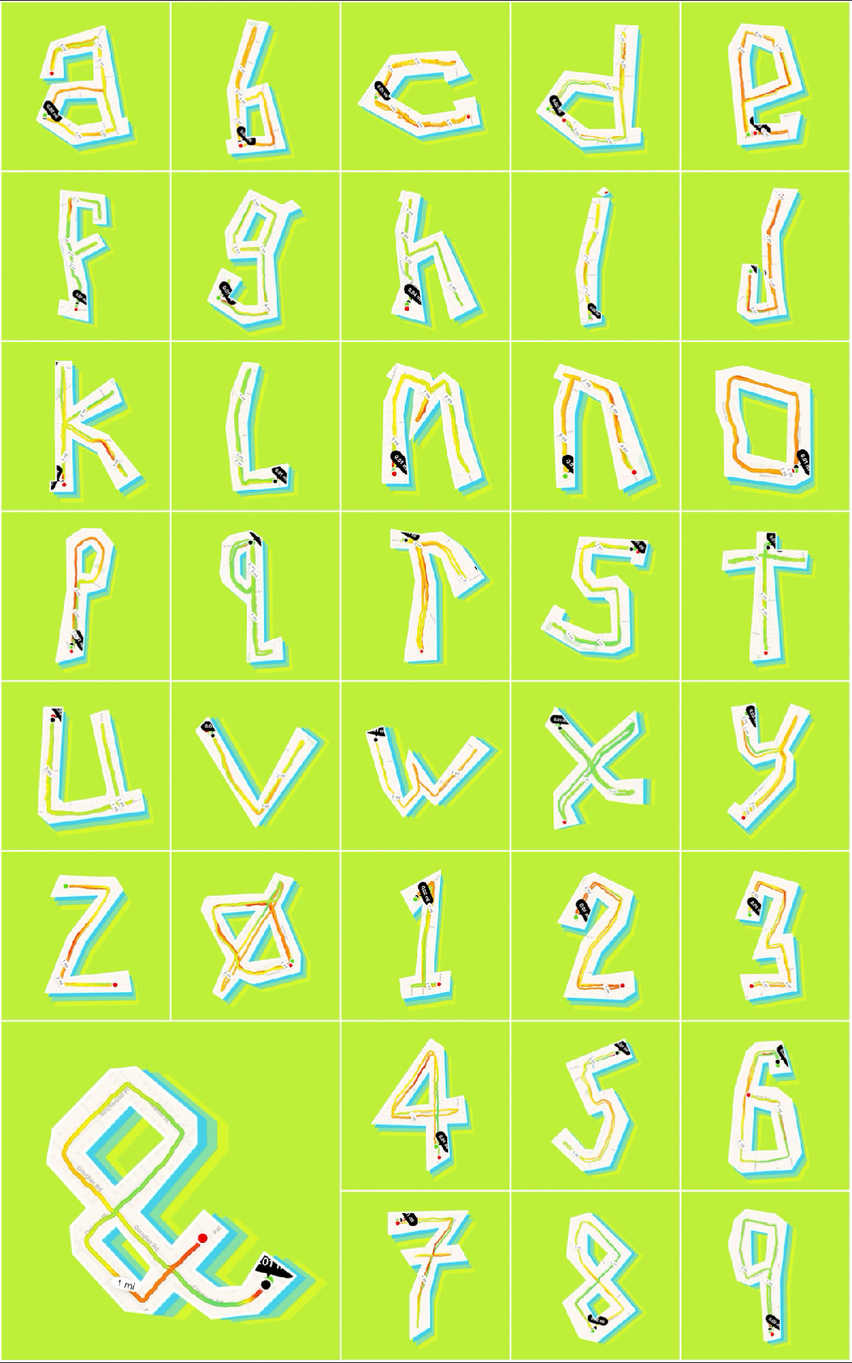
Experimental typographic alphabet constructed from GPS running routes, transforming mapped paths into letterforms and numerals.

ABCRun

Running can sometimes be boring if it’s done as part of a training program. So, one year while training for a half-marathon I decided to create a typeface that uses my running routes to create the 26 characters of the alphabet plus 0 – 9 and an ampersand symbol. This required an experimental interpretation of the structure of letterforms as well as a detailed inspection of the map containing my neighborhood. The result is a typeface that moves or runs.
Album cover featuring layered pink cherry blossom shapes over a photographic garden scene with the title “Flow of Nature” arranged among the flowers.

Album Cover Design

Research a soundscape of your choosing. Create a design system of typography, color, image treatment, and graphic elements based on the essence of the soundscape. Write unique text for the artist name, album title, and song titles. Update all the extra important text credits and verbiage. Design the outer jacket with a die-cut, inner sleeve, record label, hype sticker, and a unique disc shape to be cut on the laser cutter. Put it all together in a grab-your-attention head-banging dance-the-night-away hands-on tactile vinyl record packaging.

Photograph of Uluru at sunset with large olive-green letters spelling “OUTBACK” placed among the grasses in the foreground.

MegaTyposaurus Rex

Research cityscapes, landscapes, and waterscapes of the assigned continent. Apply extrusion, focus, overlap, perspective, scale, shadow, and transparency to the word that describes the environment to enhance the three-dimensional space in the photograph. Make the type an object.

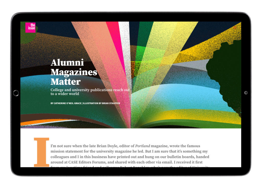
Feature spread designed for a digital publication, combining illustration, typography, and editorial hierarchy to introduce a long-form article about higher education magazines.

The Issue

The Issue is a publication to inform, inspire, and celebrate the work being created at and for member publications. In this digital publication the 2communiqué team collaborates with our content creation partners to develop articles, illustrations, photography, animation, and video to push the boundaries of what a publication can be and to take advantage of the digital medium. Each article is art directed to accurately merge the written and visual communication and to also develop a unique interactive experience.

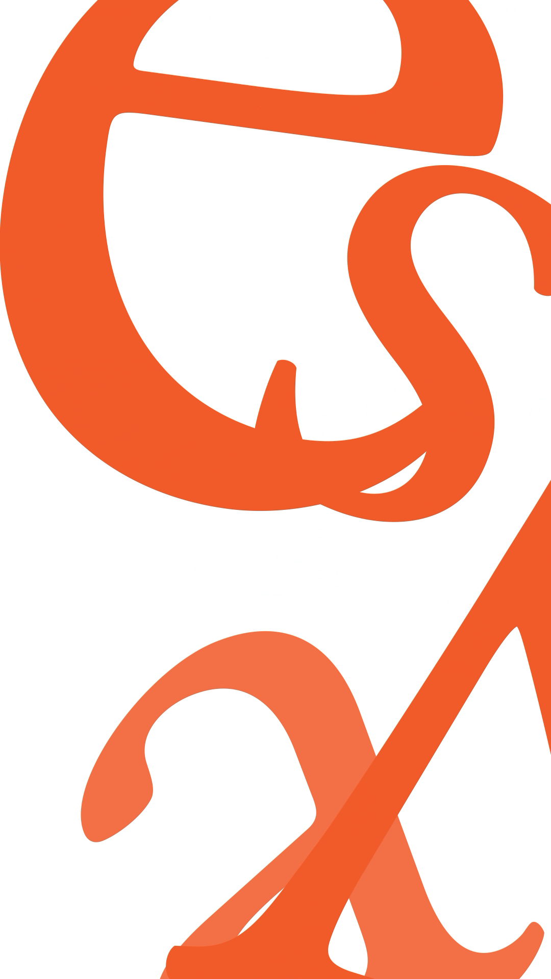
This typographic exploration transforms the word itself into an expressive visual composition. The enlarged letterforms extend beyond the boundaries of the page, emphasizing shape, rhythm, and gesture over immediate readability. Through cropping, overlap, and scale, the composition encourages viewers to engage with the formal qualities of the type while gradually discovering the underlying word. The restrained color palette and confident use of negative space reinforce the poster’s emphasis on abstraction and typographic form.

Solipsistic Word

Select a word that implies movement. Communicate the meaning the word using only the letters in the word and motion design principles. Explore motion, speed, duration, and ease.

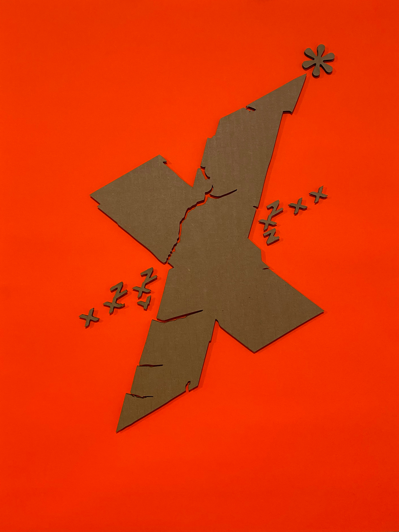
Abstract composition built around an angular X-shaped form, using fracture lines and repeated symbols to suggest tension and movement.

Type Transfer Lasercuts

The original type transfers were created as an experiment of randomness, play, and response. The laser cuts further explore those aspects of process in the digital environment. The digital tools provide opportunities to replicate exactly specific parts of the design to create compositions are both analog and digital. The use of the substrate was intentional to juxtapose the analog material of cardboard and the production tool of laser cutter.

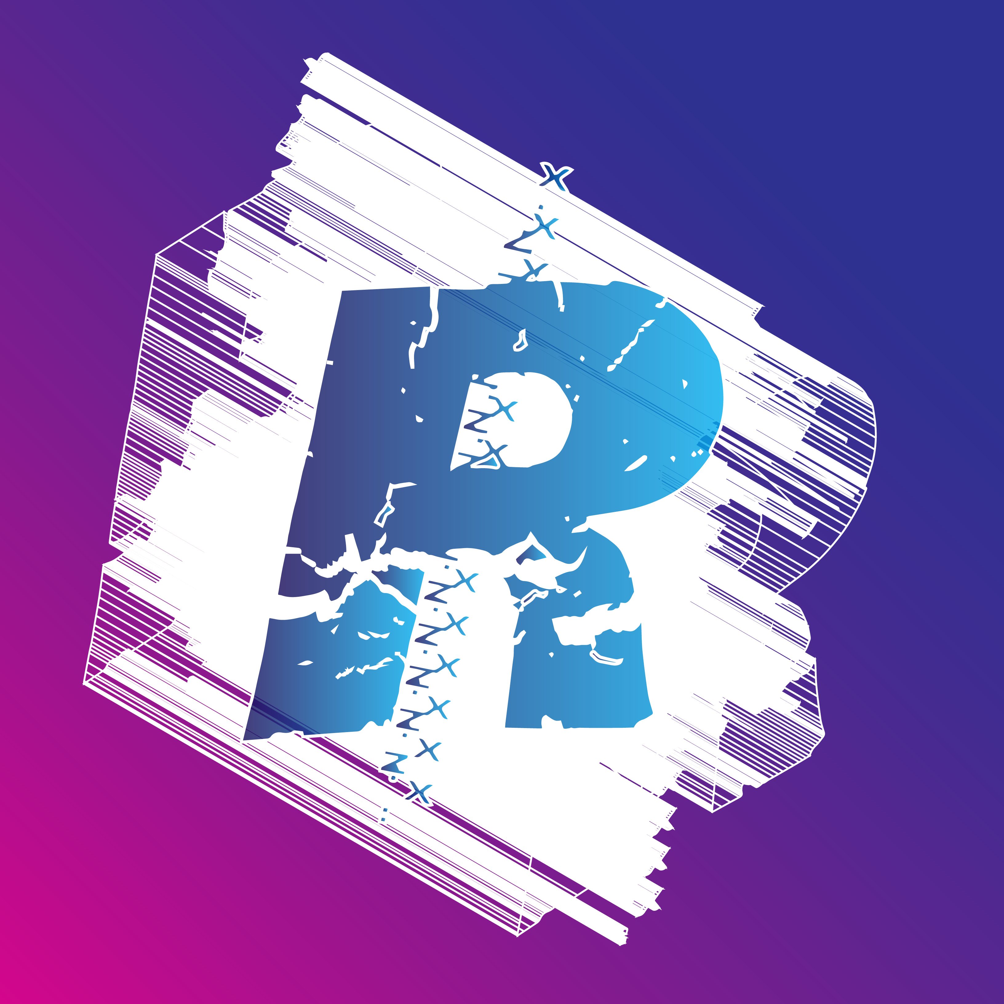
Experimental letter R composition with distressed white textures, blue gradients, and stitched graphic elements against a purple and magenta background.

Polatype Transfers

What do we gain and lose as a result of new technologies is always a question that follows innovation. Do we like the Polaroid film because of the materiality of it or because it reminds us of a part of our history or because it’s instant? The Polatype Transfers is an experiment of analog and digital technologies that explores the strengths of those technologies. The result is a series of images that are old and contemporary; photograph and print; handmade and digitally made; and something entirely new.